
Quick Watercolor Tip: Light vs. Dark Colors
To create light colors, such as light red, add more water and use less pigment. To create dark, rich colors, such as dark blue, use more pigment and less water. You can also mix in a tiny amount of black to darken a color, but use it sparingly—black can quickly overpower the original color and make it look muddy. Add a little at a time until you achieve the shade you want.
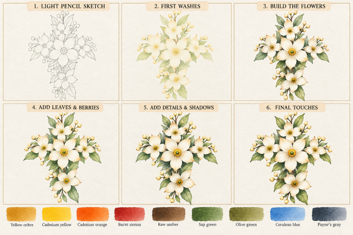
Step 1: Light pencil sketch (Skip if you purchased one of our watercolor art kits)
- Lightly sketch the placement of the large central flower and the smaller flowers above, beside, and below it.
- Draw five or six pointed petals for each flower.
- Add the leaves, small round berries, and thin stems to create the flowing arrangement.
- Keep your pencil lines light and avoid drawing every leaf vein.
Tip: Focus on the overall shape and spacing first. The arrangement should flow naturally rather than look perfectly symmetrical.
Step 2: Paint the first washes
- Mix a very diluted wash of yellow with plenty of water.
- Lightly tint the white petals, leaving plenty of the paper white.
- Paint the leaves with a pale green wash.
- Add a very light yellow wash to the berries and stems.
- Let everything dry completely before adding more color.
Tip: White flowers depend on the white paper for their brightness. Use very little pigment in this first layer.
Step 3: Build the flowers
- Add a second, slightly stronger wash of yellow near the base of each petal.
- Use a touch of brown to warm the tips and edges of selected petals.
- Paint the flower centers with small dots of yellow and dark yellow.
- Add a little green around the centers for contrast.
- Leave the outer edges of many petals soft and light.
Tip: Shade each petal individually, following its shape from the center outward.
Step 4: Add leaves and berries
- Layer green and dark green on the leaves.
- Leave a lighter strip through the middle of each leaf to suggest its central vein.
- Add darker green along selected edges and where leaves overlap.
- Paint the berries with pale yellow, then add a touch of brown to one side.
- Use a fine brush to add the thin stems.
Tip: Vary the greens. Some leaves should be light and fresh, while others should be darker to create depth.
Step 5: Deepen the shadows
- Mix a very diluted gray or a tiny amount of light blue with brown for soft petal shadows.
- Place shadows beneath overlapping petals and around the flower centers.
- Deepen the leaves with green mixed with a touch of gray.
- Add darker green behind the flowers and beneath the berries.
- Strengthen a few stems with dark brown.
Tip: Keep the shadows subtle. Too much gray will make the white flowers look dirty instead of luminous.
Step 6: Final touches
- Add fine petal lines using a small detail brush and a diluted warm color.
- Strengthen a few flower centers with tiny yellow and green dots.
- Add delicate leaf veins with a darker green.
- Preserve small white highlights on the berries.
- Deepen only a few shadows to make the flowers stand out.
- Let the painting dry completely before erasing any remaining pencil lines.
Tip: Don’t outline every petal or leaf. Soft edges, white space, and a few crisp details will give the arrangement its delicate watercolor appearance.
Most important tip: Save your darkest colors for the leaf overlaps, flower centers, and a few petal bases. The contrast between those shadows and the untouched white paper is what makes the flowers look delicate and dimensional.